Monday, 13 January 2014

Dickens in the Burial Place of the Fashions


Second-hand clothes shops are as much a feature of our era as of the Victorian age. Now, primarily labelled as charity shops, they regularly pop into existence to fill the retail voids in all our towns and cities, many of them settling into those voids as comfortably and tenaciously as any hermit crab. In Charles Dickens’s time of course ‘charity’ was funded by direct philanthropic donations, or by the circuitously indirect route whereby worthy ladies sewed or tatted items of dubious utility which they then sold to each other in order to raise funds for their less fortunate neighbours.

In contrast, Victorian second-hand clothes shops had nothing to do with any charity other than that which began at home. Their owners survived by selling such items as ‘a deceased coat … a dead pair of trousers … the mortal remains of a gaudy waistcoat’ to the poor who gave the clothing a second lease of life. In his early collection of essays, Sketches by Boz (1836) Dickens uses graveyard imagery in ‘Mediations in Monmouth Street’, not only to indicate the usual source of such clothing but to highlight the fact that Monmouth Street had for generations been the home of second-hand clothes dealers who, having eventually grown singularly unimpressed by changing tastes, preferred to ‘immure themselves’ in ‘the burial place of the fashions’; a place for which Dickens declared a ‘particular attachment’.


It was the ideal place for his hyperbolic imagination to take flight: ‘We love to walk among these extensive groves of the illustrious dead, and to indulge in the speculations to which they give rise … and endeavouring, from the shape and fashion of the garment itself, to bring its former owner before our mind’s eye’. Such speculation leads him to see, in a collection of suits displayed outside a shop window, one individual’s ‘whole life written as legibly on those clothes as if we had his autobiography engrossed on parchment before us’. The chapters of this autobiography are composed around the following outfits:  
 
 
  • Firstly, the ‘much soiled skeleton suit’ of a small boy, with knees rubbed white through playing on the floor, and the sticky smears of sweets around the pockets and under the chin providing evidence of the kindly nature of the child’s ‘indulgent mother’. Then the schoolboy’s ‘corduroys with the round jacket’ splashed with ink as he learnt to write.
 
  • The ‘diminutive coat’ he wore as an office ‘message-lad’ is mentioned next; this position had been secured for him by his selfless widowed mother who, in Dickens’s imagination, cheerfully sacrificed her own food to nourish her growing boy. But Dickens implies that base nature cannot be improved by loving nurture.
 
  • The next outfit allocated to his subject is a ‘smart but slovenly’ suit, ‘redolent of the idle lounger’ and his ‘blackguard companions’. The companion image of the anxious mother is evoked, feverishly waiting for the wastrel in her ‘solitary and wretched apartment’, then stoically bearing the ‘brutish threat’ or ‘drunken blow’ on his return.
 
  • Next, a ‘broad-skirted green coat with large metal buttons’ conjures the form of a repulsive ruffian with ‘a dog at his heels’ (the ghostly herald of Bill Sykes perhaps) whose wife and child starve while he staggers, once again, to the tap-room. For Dickens the ‘vices of the boy had grown with the man’, or with the clothes.  Pathos (or bathos) cloaks the narrative as the mother dies, abandoned in the workhouse, still ‘imploring pardon for her son’.
 
  • A ‘coarse round frock, with a worn cotton neckerchief’ completes the history, as the sins of its wearer carry him inexorably to transportation, or to the gallows.
 

 Dickens restores what he claims is his ‘naturally cheerful’ disposition by fitting imaginary feet into a ‘corps de ballet’ of boots and shoes, and setting them off on a riotous dance which closes the piece, and which  I strongly recommend as an antidote to the dire tale of the suits.

However, I blame Dickens for the fact that I now have to fight the temptation to ‘see’ the past wearers of clothes displayed in the windows of second-hand clothes shops – even if few of those outfits will have clothed such a grim or grisly individual as the one whose ‘ghastly form … lay rotting in the pauper’s grave’ while his garments haunted ‘the burial place of the fashions’!           

 
Sue Elsey, University of Chester. 

Thursday, 12 December 2013


An Update on the Anniversary Quilt
December 2013


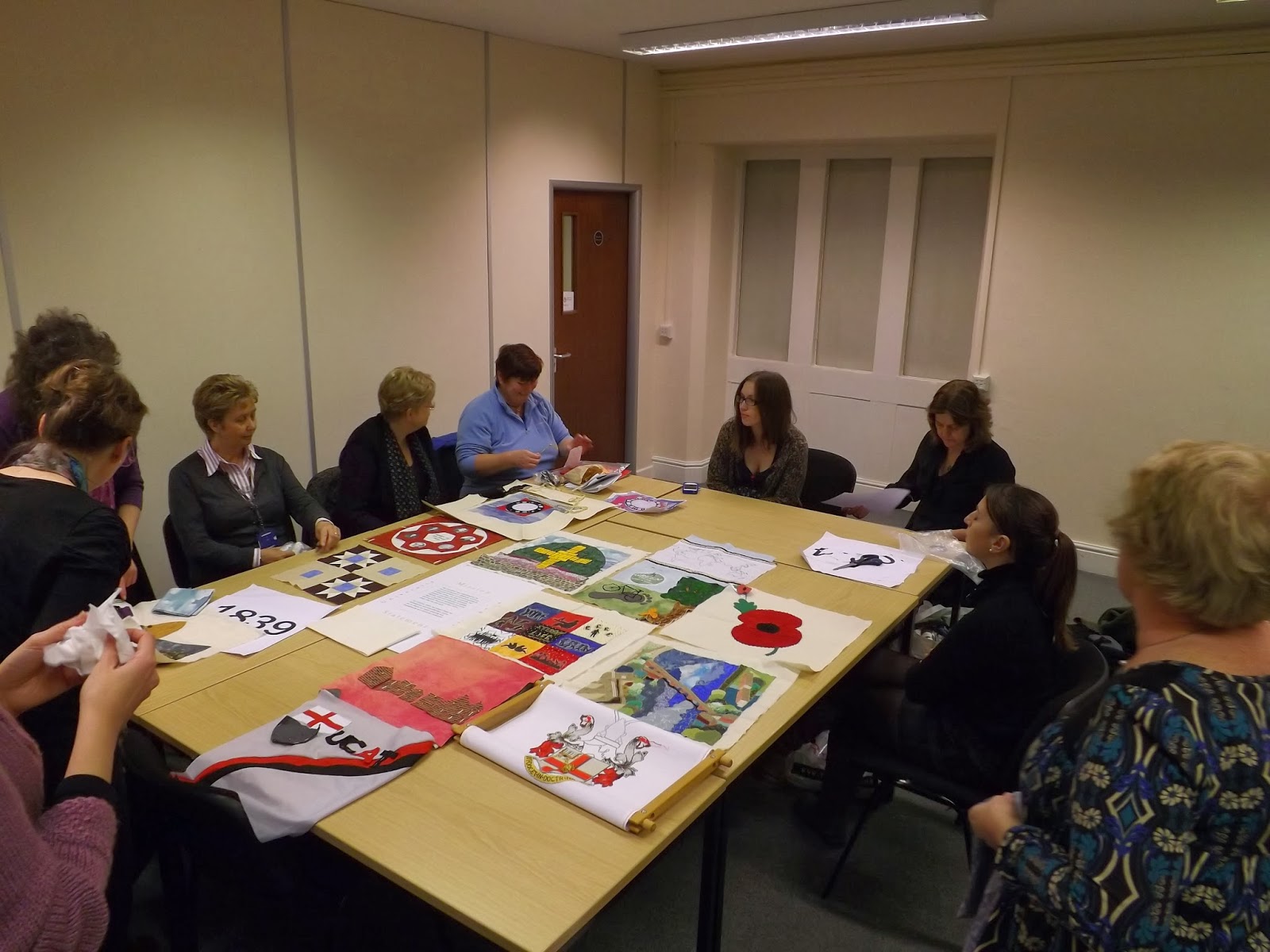
The quilt group decided to have a get-together at the end of term to place all finished (and nearly finished) blocks together on the table, to see how they looked. This would help to show which colours were predominant and to identify aspects of the University's 175 year history not yet represented. The table was a kaleidoscope of colour, texture, fabrics and stitches: it was fun to take a step back and review our achievement!


Of the 25 blocks, 21 have been started, and 6 completed already. Fifteen members of the group attended, admiring each other’s handiwork. Several felt that they would have time during the Christmas holiday to complete their blocks in time for the next meeting, as the weeks leading up to Christmas are so busy. Pat suggested that one of the spare blocks could depict Chester College. Fiona offered to look through old photographs and documents to see if there is anything which could be adapted.

Everyone is looking forward to seeing even more completed blocks at the next meeting in the New Year.


Michelle Spruce has given us an update on her block:

My block will represent Student Life. I have worked for the University for a number of years and have also recently become a student again, starting a postgraduate Masters degree at Chester, so I felt this was quite a fitting theme for my block. I also work in the Academic Quality and Enhancement department where we are focused on maintaining and improving the quality of both academic matters as well as the student experience. Due to the pressures of work and study this year I did leave it a little late starting my block and so (in true student fashion) had a mad dash to meet the deadline for having my block finished!!!


The different colours and patterns of the squares I have used in the background represent the variety of students at the University as well as the increasing internationalisation of the student body, with more collaborative partner organisations abroad. The silhouettes represent some features of ‘student life’. Starting at the top left block these are ‘Friendship’, ‘Studying’, ‘Student finance’, ‘Sport’, ‘Reaching for the stars’, ‘Partying’, ‘Standing up for what you believe in’, ‘Reading your subject’, and ‘Graduating’.

I had originally intended to stitch the silhouettes, however due to time pressures I opted for using transfer paper and fabric paint. I think the effect still works ok though. I’m still trying to decide if I need to add any further embellishments including a possible border. It depends how my design looks when put against the others.

Monday, 25 November 2013

The University Anniversary Quilt


During November 2013 the quilters have been making considerable progress and a December meeting has been scheduled where everyone will bring their finished blocks to be laid out.

As Fiona states, we will then be able to ‘see what the predominant colours are and how we can balance these. This will help us decide what the last few blocks need to be, and will show us which colours will be most suitable for our sashing and borders’.

This is how the central blocks of the quilt will look:


Anne's alumni garden square


Kate's UCAT square


Kath Roberts: The University Crest


I’ve been using more than a little artistic licence during the stitching of the crest. For example, I thought the lettering for the motto would look better with a combination of backstitch and stem stitch, as it wouldn’t have been readable in full cross stitches as shown on the chart. I have also outlined the main shapes of the crest in full cross stitches in one colour to emphasize them, and then have filled these in with the charted colours, but have deviated from the computerised chart – if I’ve missed or added stitches in a particular colour I’ve just let it be – the overall finished effect should be the same, and I know I haven’t got the time to keep unpicking and redoing stitches. It is taking me much longer to stitch than I originally anticipated, one of the main reasons I’m not religiously following the chart, the other purpose being that at least the design will have had some creative input from me, instead of just following the computer generated chart.


The University Crest is almost complete!


The Mission Statement square


This has been designed by Louise Botten, former PA to the Vice-Chancellor, however due to other commitments Louise can’t do the actual stitching, so I have offered to do it. It shouldn’t take too long to complete (hopefully) once I’ve done the Crest, consisting of whole cross-stitches and backstitch for the main block of lettering. It will be stitched in the University colours on cream 14 count aida.


Fiona's Beswick building square


Pat's rememberance square


Layout of ideas for the label text


Ideas for the dates


The quilters are looking forward to seeing what has been completed so far laid out at the next meeting. Everyone has been keeping note of the hours they have spent working on the quilt and it will be interesting to find out just how much labour has gone into it so far!


Tuesday, 1 October 2013

Dressing and Undressing in Pride and Prejudice


A Talk by Professor Deborah Wynne at the Chester Literature Festival, 24th October 2013 at 5.30pm to celebrate the 200th anniversary of Austen's Pride and Prejudice


The bicentenary of Pride and Prejudice in 2013 has highlighted the continuing popularity of Jane Austen and her most famous novel. Not only was it recently voted the favourite reading of the nation’s teachers, but Austen herself has been chosen to appear on the new £10 note. What is the basis of Austen’s appeal to readers today? Why have so many screen adaptations of Pride and Prejudice been made? Professor Wynne will address these questions by considering the relationship between the novel and two iconic screen adaptations of Pride and Prejudice: the 1940 film starring Laurence Olivier and Greer Garson and the 1995 BBC television series starring Colin Firth and Jennifer Ehle.

For more information, click on the link below:

http://www.chesterliteraturefestival.co.uk/blog/portfolio/deborah-wynne-dressing-and-undressing-in-pride-and-prejudice-reading-austens-novel-and-its-screen-adaptations/


Monday, 30 September 2013


THE ANNIVERSARY QUILT: AN UPDATE

The design for the community quilt to commemorate the University’s 175th anniversary in 2014-15 is now taking shape. Many members of the quilting group have decided on the design of their block and some are making good progress with the sewing. Here are a few updates on the innovative and striking designs created by Helen Berrie, Jenny Mann and Fiona Roberts.


Helen Berrie: The Kingsway ‘Flying Saucer’


For information about this sculpture, see:  http://www.chester.ac.uk/node/15600.


Helen writes: “I chose to make the quilt square of this as it is a striking sight which I pass most mornings on my way to work.  The building at Kingsway would have been a bit too challenging (possibly not recognisable on the quilt) and I wanted to ensure some of the other University sites were represented along with main campus.  I also thought that an artwork such as this flying saucer was a good representation of Kingsway as it is the home of the Faculty of Arts and Media.”


Here is a photograph of Helen’s work in progress:


Jenny Mann: 'Founders’ Day, 25th January 1839'


The University’s Six Founders: William Gladstone, Horatio Powys, Edward Stanley, John Bird Sumner, James Slade, Henry Raikes


Jenny writes: “My initial idea was to recognise the 6 Founders and incorporate their pictures onto a block using a patchwork technique popular in 1839.  Research confirmed that paper pieced hexagons were very popular in this period.  This is a technique I love doing, so an easy decision to make.  Having an idea, i.e. printing a photograph to fabric, is one thing and putting it into practise is another. A friend came up with calico fabric sheets that can go through a home printer.  However during a visit to the Quilter's Trading Post, to source the fabric for the hexagons, a different option was presented.  The owners have facilities to print directly to a fabric background.  This means that the 6 Founder's photos and all their names and the title can be printed at the same time.  I can then applique 6 hexagons onto the background.  Each hexagon will have a 6 cm circle cut in it to frame the face of a Founder.


The colour for the hexagons is a very deep rusty red - apparently red tended to be 'rusty' in the early 19th century.  It is a good match to the red of the University of Chester shield.  I have also sourced some tiny number 15 beads which I plan to sew to the outer edges of the appliqued hexagons.  

So I have been drafting up the block and have today sent, electronically, the mock-ups and photographs to the Quilter's Trading Post.  I shall follow this up by either posting all the mock-ups or taking them to the shop.  

The photographs show the positioning of the images of the Founders and the text for the printer. One shows the hexagons in place and the last is the ring of hexagons, useful I thought for checking everything is in position before the final printing to fabric. 


The font chosen is Franklin Gothic Medium 20 bold for the names and 36 bold for the title.

I will not be making the hexagons up until I have the printed fabric in my possession.”


Kath Roberts: The University Crest


Kath writes that doing the University crest in cross-stitch has been a challenge. She has "revised what I am capable of doing by February, and have decided to use the 40 colour chart instead of the 60 colour chart.  I thought I was in serious danger of going mad trying to follow the 60 colour chart, the 40 colour one is easier to follow but should still give a good result – it looked from the 60 colour chart that in some cases only a few stitches were in any one particular colour so it shouldn’t make too much difference to the look of the finished result."


Fiona Roberts: The Tiled Floor in the entrance to Senate House


Fiona writes: “I felt that the pattern of the tiles was reminiscent of a patchwork block and that is what led me to choose this as a design for my contribution to the anniversary quilt.  I originally looked at the Minton tiles in the Chapel, but they have so many curved lines in the design that I knew it would be very complicated to reproduce in fabric!  I then found these tiles and felt I would be able to make a neater job, though I still have a few stray threads to tidy up. 


The floor tiles in Senate House and Fiona’s representation in patchwork


To make the block I calculated the size of the two light coloured blocks, each with nine equal squares – a pattern known as “Nine-Patch”.  I made these, and then experimented with the more complicated triangles, and got the dimensions right on my second attempt.  I can’t wait to see what everyone else has come up with!”

Some members of the quilting group recently consulted the owners of Quilters Trading Post for advice on the best method for putting the blocks together.  Renowned machine quilter, Pam offered to host the group when they were ready to put together the blocks and sashing, and to quilt the top using one of the shop’s long arm quilting machines.  This will bring a more professional finish and will ensure that all of the unique features are shown to their best effect.  Much forward planning was needed to estimate when this work will be done, as there is around a four month waiting list for this service! 

If anyone is interested in having their own work quilted, they can contact Pam at www.quilterstradingpost.co.uk


Monday, 19 August 2013

A Frenchman in Brighton in the 1850s


Francis Wey, a French writer, travelled to England in 1856 with the idea of recording his impressions of the English and English life. His account refers to many details of clothes, from the marvellous riding-habits of ladies in Hyde Park to the rags of beggars on the London streets. Yet Wey is extremely surprised to find that English men bathe in the sea naked. On a visit to Brighton Wey, believing that he should respect local customs, reluctantly abandons his clothes in the safety his bathing machine and ventures cautiously into the sea. However, after a long swim he learns a rather odd lesson about English prudishness.

He writes:

‘I spent two days at Brighton, where an Englishman, I am told, can find enjoyment. […] In fine weather bathing takes place in full view of the front, swarming with idlers of both sexes. Men go into the water stark naked, which surprised me, knowing how easily shocked English people are. Never shall I forget my bathe at Brighton! It was on a Sunday, at the time at which worshippers return from church. I had been assigned a cabin in which to undress. It was a wooden construction on wheels placed at the water’s edge, with steps half-submerged by the waves. Getting into the sea was easy enough, as my cabin screened me from view.


Unfortunately, I went for rather a long swim, as I wanted to get a good view of Brighton from afar. […] When at last I regained my depth, I found that my cabin, which I had left with water lapping the hub of the wheels, was now high and dry at fifteen paces from the sea. To put a finishing touch to my discomfort, three ladies, a mother with her daughters, had settled themselves on camp stools in my direct line of approach! They seemed very respectable females, and the girls were both pretty. There was no possibility of reaching my cabin without passing in front of them. They each held a prayer-book and they watched me swimming about with serene unconcern. To give them a hint without offending their modesty, I advanced cautiously on all fours, raising myself by degrees as much as decency permitted. […] As the ladies did not move, I concluded they had not understood my dilemma […]. What was I to do? Remain in the water and inconvenience my host, or emerge from it and affront the ladies? I determined on the latter course. After all, why had they settled just there? I rose slowly, like Venus, from the waves. Striving to adopt a bearing both modest and unconcerned, reminiscent of the lost traditions of innocence of a younger world, I stepped briskly past the three ladies who made no pretence of looking away. I felt the blood rushing to my face. […]


Bathing machines at the seaside

When at last we got home, Sir Walter [his host] teased me good naturedly about my misadventure, and his wife told me that she knew the ladies, who were very puritanical! They disapproved of bathing on Sundays and had adopted that unexpected method of discouraging Sabbath-breakers. Could one conceive a stranger mode of teaching a transgressor to be virtuous or of performing an act of religious fervour?

I would, perhaps, have omitted this incident, but for its bearing on various observations I have made on the inconsistency of English prudishness. In reality it is mostly offended by words. If one can replace the actual expression by some euphemism conveying exactly the same meaning, all is well!’


From: Francis Wey, A Frenchman Sees the English in the ‘Fifties, trans. Valerie Pirie (London: Sidgwick and Jackson, 1935), pp. 296-299


Tuesday, 6 August 2013

The Anniversary Quilt


In 1839 the University of Chester was founded and plans are underway to design and construct a quilt to commemorate the 175th anniversary. Here are the latest design ideas and updates on progress so far. 


Kath Roberts
I decided to depict the University Crest and chose this block mainly because I enjoy cross- stitching and tapestry and thought this would be a challenge as I haven’t done anything this complicated for some time!  I think our crest and logo are very striking images, probably one of the best traditional HEI logos, reflecting the long history of the University and relating back to the foundation of Chester College in 1839.
 
In many ways this block is the easiest to design – Michelle recommended online sites that convert a digital picture to a cross stitch pattern, so I converted a jpeg image of the University Crest using the Pic to Pat website, on 14 count Aida fabric and using DMC threads.  So there hasn’t really been any ‘design’ input from me, it will all be in the stitching!  I have decided to use the pattern that consists of 60 colours (the more colours used the greater the detail).  Shirley had some thread colours that she very kindly passed on to me to keep the cost down.  All I have to do now is stitch and hope I can finish it before the deadline for making up the quilt!

This is the website I used:


and this is what it should look like when finished!


Shirley Bowers

If someone asked me to highlight an iconic representation of Chester – it would have to be the Eastgate clock. 


I have been thinking about the best way forward with my design.  Firstly I thought of just completing it in ‘blackwork’ but then decided on a collage of materials including lace for the ironwork. I took a fair but of time regarding the actual size of the clock face and decided on a 6” face so I purchased a black plastic face from EBay !!


Fiona Roberts has given me some material that looks like the sky which will be the background and Felicity Davies has agreed to stitch it onto the calico material  supplied by Maxine Bristow.

Great team to work with – full of good ideas.

Fiona Roberts
I have decided on a design and am nearly ready to start my anniversary block at last!  I’m going to do a traditional patchwork block using the layout and colours of the tiled floor in the entrance to Senate House, which used to be the Principal’s residence, and where students came to be interviewed when they applied. 
 
The Victorian floor tiles in the entrance to Senate House.